
Tuesday, 17 December 2013
Friday, 13 December 2013


Focus Groups & Target Audiences
In light of the results of our survey, I interviewed members of our target audience in order to get a better idea in terms of qualitative data what it is about a film that gets people watching. Three boys were interviewed and one girl, all seventeen.
Fitting our assumptions, two of the boys were into the action and thriller genre, and they were attracted to it because of the promise of excitement and adrenalin, although it was mentioned that violence should not be overtly gratuitous and should be done right. The girl agreed that action films are watched for the purpose of entertainment and do not need to develop on any other elements of plot, yet interestingly this was reason that our male interviewee did not like action films. He expressed that he enjoyed drama, romance and comedy because they included an "emotional connection" between the characters that was involving, and particularly that character development is a rewarding process. This view is at odds with the other male interviewees, one of whom stating that human interest stories were not really of interest of him because he only watched films for entertainment and escapism, not as a mirror to real life.
Thus, documentaries were not high on the watchlist of the the action-and-thriller boys, but all the participants agreed that a big factor in making a documentary interesting is presenting a subject that is unfamiliar to the viewer, so learning about a completely new topic is a rewarding experience. Popular criteria for a watchable documentary is that they be somehow relevant, maybe containing 'current affairs', or 'trashy' in the style of Channel 4, with human interest being a strong factor as long as it is entertaining. One of the boys mentioned that he only watched geographical/wildlife elements, but yet it was still the aforementioned element of discovering the unknown, and not "stuff form day to day life" that appealed to him.
In terms of the 'gritty' urban thriller genre, there was a general agreement that its portrayal is often heavy-handed and cliched, and so stereotypes must be avoided in order for a film to gain credibility, and perhaps incorporation a plot twist to keep the genre exciting. As our female interviewee said, once you have seen one generic urban thriller "you have seen them all".
Viral media such as Youtube was the most effective form of getting mass publicity for a film, but the most valuable of exposure was recommendation from a friend. Thus it is important for our film to strike a chord with a certain demographic for it to get good reviews, but attempting to reach as many markets as possible because 'human interest' stories have a fairly universal appeal. Furthermore, the trailer should showcase accurately the vague premise of the film without giving too much away so that the viewer has a notion of what to expect from the genre.
SL.
Mood and Tone

Our drama is a sports documentary with a blend of 'urban' drama, and do it needs to incorporate an energetic pace with a certain darker mood. Themes include struggle, relationships, sportsmanship, redemption and triumph over tragedy.
A lot of the colour palette will adhere to a grey/blue-tinged grain similar to Fish Tank and Into the Abyss (bottom right and bottom left respectively), a typical representation of urban landscapes in order to establish the audiences' expectations and understanding of the geographical context . However we will aim to subvert these visual stereotypes by including more green landscapes such as parks, flowers as trees, in scenes with the tennis court and in the park. After all, almost 40% of London is covered by green space, particularly the numerous commons and parks in South London, so it would be wrong not to include those aesthetics. Furthermore, youth culture is extremely dynamic and creative and this should be represented at least through colourful and stylish clothing; this varied the palette and make the film more visually exciting and avoid drab stereotypes. Inspiration for this can be taken from This is England, where fashion plays a large party of cultural identity and representation of the time; in this case with the characters expressing themselves as members of 80s counter culture (center bottom). Other aesthetic influences include China Heavyweight (Center), because although these people may come from small town agricultural/industrial China, they still present their individualism through their bright clothing and adoption of Western brands. This perhaps may be seen as a visual metaphor as they desire to break free of their rural, insular background and achieve their dreams on an international platform.
SL.
Film Poster Research

Colour & Tone = Upon first glance, this poster is aesthetically striking because of the contrast of the moody black and grey background lit up by the almost violently bright orange flame. This poster suggests to me that this is a film whose subject matter is dark and gritty, with the explosion of fire against grey skies connoting themes of conflict and perhaps destruction 'overhead'. Alhough our films subject is not as grim and hopeless as "There Will Be Blood", I like the way colour suggests a variety of (at times) contrasting themes.
Imagery = Character is established in the left hand side of the poster (immediately influencing our gaze upon the order of the images), and the fact that he has back turned creates a sense of mystery around the individual. Furthermore his hunched stance upon the chair asks contrasting questions; is he worn out and withdrawn from the chaos he sees before him, or is he about to leap into action. Or both?
Text & Font = The main titles are in the style of calligraphy, and this automatically suggests that this is period film, so thus establishing genre. Our film's font will proabably be a bit more ambigous but still try to deliver a simple message that it is, for example, not a chick flick. There are minimal credits, only the main actor and the writer/director, and our film will probably have a similar lay out because it is a documentary, and so relies less on big name stars, and more upon the prestige it recieves, as highlighted by the film awards placed centrally on the poster of "There Will Be Blood".

Colour & Tone = The obvious inference to make about the colour palette is that the bright red text is symbol of spilt blood and other themes of violence and crime. Set against the conrasting black background, it is strong and striking as aposter, with a dark and sinister to feel to it. However our film is not going to be 'sinister', but I like the way you can immediately tell its genre as a thriller, and is bold in its motives.
Imagery & Layout = I particularly like this layout for our film poster because the main image of the prison-tattoed head is not only visually impressive, but motivates the viewer to questions the themes and ideas it represents. For example, the appearance of the tattoes alludes to the idea of criminal gangs and wrong doing, especially with reference to the provocative tagline 'every sin leaves a mark'. A suit sleeve is visible, as well as an expensive watch, suggesting that it is centered arond high-stakes organised crime rather than just any criminal gang, and definitely a reference to the Russian Mafia with the appearance of a cyrillic tattoo. The hands are distinctly masculine, and this could be a reference to the kind of audience and genre this film is representing, which is mostly males watching crime and action thrillers.
However, to stop it from being a bit too obscure, some more visuals are added in the form of character action headshots beneath it, just above the title. This gives the poster more depth by not only well establishing two main characters but also have them in alarmed and urget poses, connoting that conflict is going to be everpresent in this fast pace film.
SL.
Graphics Influences

'The Act of Killing' has preferably simple and clean font, that was reported to be visually striking by our focus group. The equal spacing between the letters makes the title command the width of the screen and gives it a strong impact. As opposed to something more directional and perhaps artistic, I feel that documentaries benefit from having less flamboyant font because they are focused on telling a real life, investigative and analytical piece, and the graphics should reflect this.

Further inspiration comes from Scandinavian brand
Which has a 'no-frills', simple but effective font, emphasizing the point I made earlier.
In terms of real examples, 2007 'Control' has similar themes of intertwining struggle and success, as well as being similar to a documentary because it is a biographical film, and its font reflects the style we would like. Furthermore, I like how the grey fade gives it a shadowy depth, that is similar to its neo-noir style.

'Up in the Air' (2009)

In the example of the "Up in the Air" the fonts is leaning a bit too much towards a 'comic sans' direction that we don't want, but it has a clear spacing on different parts of the screen that highlight establishing shots of the background, which allude to the idea of the central themes being about flying, travel and restlessness. Ideas of restlessness will also play a part in our film, since the central characters are striving to make a transition from their current lives towards their sporting goals, and this suits the shifting structure of the credits and the dynamics against the background.
SL.
Music Production

.tiff)


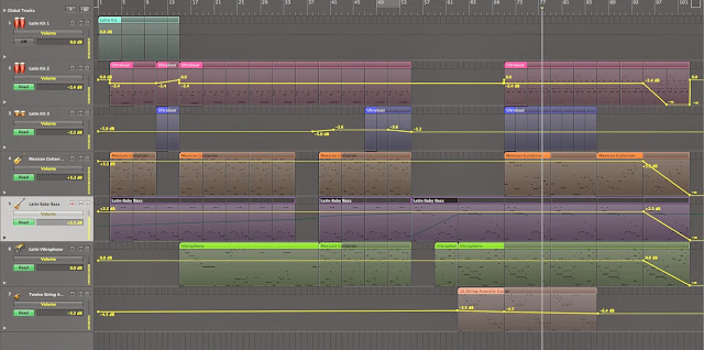
Here you can see screen grabs i have taken from various elements of one of the Logic Pro 9 files that I am working on for our trailer. The top image depicts an overall view of the project, showing the different tracks, each one colour coded for efficiency. The second image shows the volume automation for each track, although it is also within Logic Pro 9's capacity to automate filters, various modulators, pitch and pretty much any element of a plug-in that is allowed, coming in extreme handy when attempting to build to a crescendo in a song or to build on the depth of the soundscape you are creating, bringing in and out elements seamlessly. The next three images show plug-ins. The first being the drum synth Ultrabeat, which is designed to mimic any classic drum machine but allowing one to manipulate their individual drum sounds and beat all the more. The second plug-in is Space Design, which can be used to create a gamut of reverb patches and effects mimicking many different space's. The third plus-in is the sampler EXS24 which holds a wealth of synths and samples that you can manipulate to extreme extents. This screen grab alone displays just how much you can do with your sound, with a multitude of knobs and faders allowing you to change anything you want, depending on how familiar you are with the programme.
Ident: Planning

Thursday, 12 December 2013
Ident Influences


Ident Influences


'WATCH' use a recurring theme theme for their ident with simple variations through the use of colour and graphic both in the forefront and background. This is a similar concept to that of BBC One's ident. This is so effectve due to the reccurence of the red semi-circle and bold hollow text. By making these elements a constant, when they appear, despite whatever other graphics are being used, the viewer instantly recognises the red semi circle and associates it with the brand.

Wednesday, 11 December 2013

Tuesday, 10 December 2013
Music Influences
Influences: TRACK 3
The third track I am composing consists of much less accentuated beats and bass line, focussing more on creating a dynamic soundscape and melodies through different synths, pads and samples. This piece of music is far more difficult to classify due to its abstract structure and lack of and real defining genre convention, although one can easily identify sources from which i have drawn influence;
Part Time Heroes - Words (Fybe:one Remix)
James Blake - Don't You Think I Do
Ifan Dafydd - Miranda
These songs would be classed by most as electronic or even post dubstep and most proponents of these styles are extremely advanced at production and have honed their sound to great lengths. This slightly less frantic and aggressive style of music will help to give contrast in sound and illustrate what contrast is taking place on screen, allowing for more range in mood and tone.
Music Influences
Influences: TRACK 2
The second song I am writing is more easily classified within the wider genre of UK Garage, a predecessor of grime music. This seems only too suitable for our film, which is closely concerned with London culture, something that easily encompasses underground UK Bass music. One would not be unwise to presume that the characters in our film are aware of if not familiar with the UK Bass music scene. Here are some examples of songs that may have had influence on TRACK 2:
Ghost (El B) - The Club
Sovereign - Bug a Boo
Groove Chronicles - Black Puppet
Despite UK Garage finding its earliest roots in the US and Speed Garage having supposedly been started in New Jersey, Garage has a definitive sound that people immediately associate with England and more specifically London. This sort of music would have been the soundtrack to the lives of so many Londoners like those in our film.
Monday, 2 December 2013
Music Influences
Influences: TRACK 1
The first track I am composing for our film draws on many genre conventions found within UK Bass music. The most prominent influences in terms of genre would be Grime, 2-Step or UK Garage. Here are three examples of songs that could be crediting as having a significant influence on my production of TRACK 1:
Youngstar - Formula 2
Alias - Gladiator II
Musical Mob - Pulse X
One can easily hear the recurring use of a 2 step rhythm and pulse bass sounds, usually created through the manipulation of a kick.
The grime movement emerged in the early 2000's in the UK as an extension of UK Garage, Hip-Hop, Drum and Bass and Dancehall. Pule X is credited as being one of the first Grime songs. The genre really emerged in East London through pirate radio stations and producers movement away from the House influences of Garage and into a 'grittier' themes and sounds.
Subscribe to:
Posts (Atom)